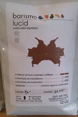
For lucid, a two Colombia pairing, we decided to play off the name and do a Rorschach ink blot look to the label ink. It's actually an outline of Colombia filled in and mirrored to get the 'blot' look. Simple, fun, and it shows a little thought went into it. It also has been rather tasty lately!
We try to do special labels for the espresso pairings/blends, some get more complex than others. See the Clockwork labels and the Soma ink if you are really curious. For the single origins, we have stuck to the countries and color coding. It's worked as I find myself missing that 'green' bag when it's not on the shelf! It gets complicated when there are multiple offerings from the same country on the shelf so we encourage you to save old labels of great coffees and write on the white space what you liked about them. If we know the exact coffee you loved, it makes things easier when searching for a similar one.